A startup's website, built twice: first in Next.js, then as plain static pages
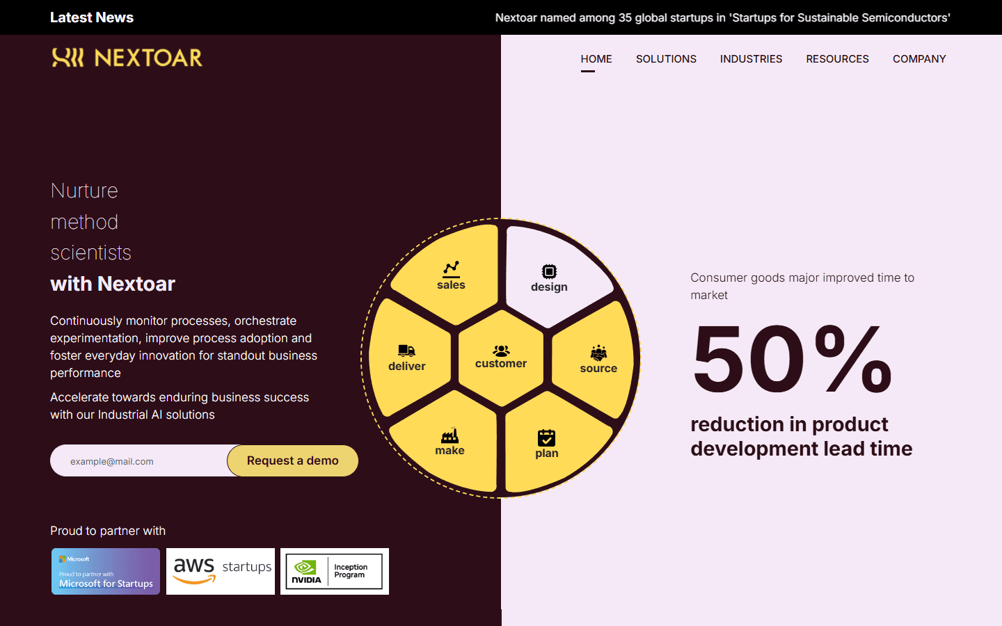
The new website for Nextoar, the industrial AI startup in Bangalore where I work as an AI engineer intern. I designed and built it to replace a WordPress site that the company had outgrown: five products where there had been none on the menu, a demo request within reach on every page, and nothing to patch. I built it in Next.js, then moved the whole thing to Eleventy, because every page is the same for every visitor and a framework was weight it did not need. It is finished and on a preview address, waiting for the switch to nextoar.com.
- Client
- Nextoar (internship)
- Role
- Designer and developer
- Year
- 2026
- Stack
- EleventyTailwind CSSJavaScriptNetlifyResend
- Reading
- 6 min
- Preview
- Visit
Context
I joined Nextoar in June 2026 as an AI engineer intern. The company builds industrial AI for factories: cameras, machine signals and operator input go in, and what comes out is a warning that a process is drifting, a defect caught at line speed, or step-by-step guidance for someone doing a complex assembly. Most of my work there is on that side. This is the other thing I took on: the company's website.
The site it had was a WordPress build from an earlier stage of the company, and three things were wrong with it at once. The company had moved on and the site had not: Nextoar now sells five named products to four industries, and not one of those product names appeared anywhere on the old pages. It was a WordPress theme and plugins that someone in a small team had to keep updated. And it did little to lead a visitor towards a conversation. For a startup selling to manufacturers, the website has one commercial job, which is to get the right person to ask for a demo.
The words came from the founders and the team, who know the products and the customers far better than I do. The structure, the design and the build were mine, working with an AI coding assistant (Claude Code). I started on it in June 2026, soon after I joined.
The site
I kept the company's maroon and yellow, because a startup should not lose the two colours it is recognised by to a redesign, and rebuilt everything else around what a plant manager or an operations head would want to know, in the order they would ask it. What does it do, how does it work, which product is for my problem, has anyone like me used it, who are these people.
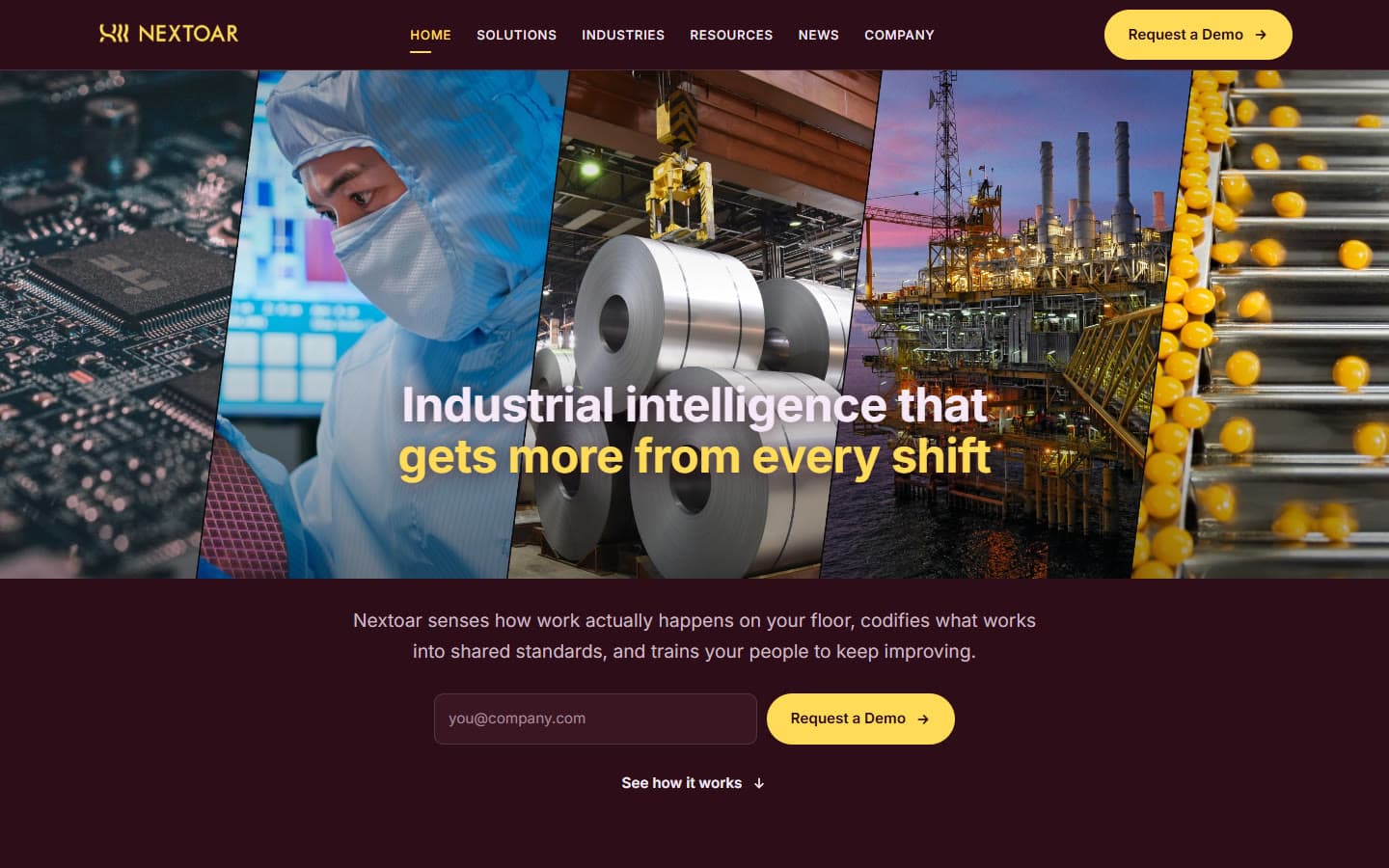
So the home page opens on the industries themselves, five photographs of the kinds of floor the product is built for, and a headline whose second line rotates through what the product is for: more from every shift, defects caught before they multiply, a line that keeps running. Below that is the loop the whole company is built on, Sense, Reason, Act and Learn, as four panels beside a product video. Then the five products, then a band of published industry benchmarks, then the industries, then a closing invitation to ask for a demo.
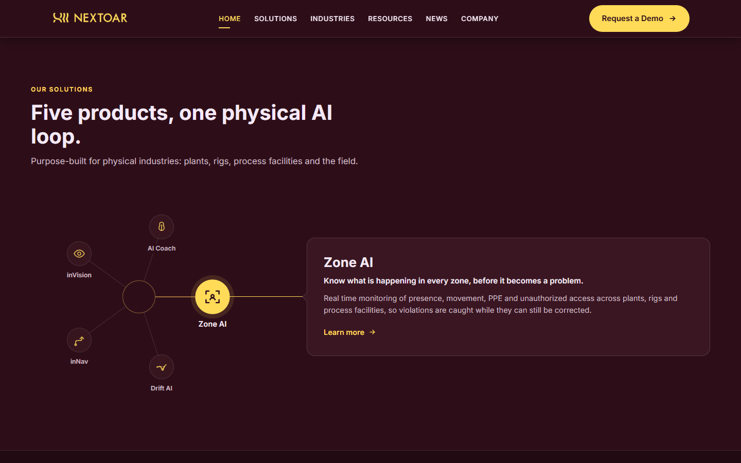
The products were the part I thought about longest. Zone AI, Drift AI, inNav, inVision and AI Coach are five things with five names, and the risk with five names is that a visitor reads them as five unrelated tools. I drew them as points around a single centre, so that the first thing the section says, before any copy is read, is that they belong to one system. Each has its own page under Solutions, written to the same shape: the problem in one line ("Processes rarely break. They drift."), what the product does about it, and its features, numbered. Industries covers Electronics, Mobility and EV, Semiconductor, and Oil and Gas on one page, with the four to switch between and, for each, where along its value chain Nextoar helps. Resources holds the company's articles, News its announcements, and Company the mission and values.
Request a Demo is the one yellow button. It is in the header of every page, beside the email field in the hero, and in a band at the foot of every page, and wherever it is pressed it opens the same short form over the page rather than taking the visitor somewhere else. The field in the hero asks for an email address and nothing more. Pressing the button records the address and opens the full form with it already filled in, so a visitor who gives up halfway has still left a way to reach them. The form goes to a small function on Netlify, which sends the request to the team through Resend, and a Cloudflare check keeps bots out without showing a puzzle unless it has to. There is no database behind the site and no admin panel in front of it.
From Next.js to Eleventy
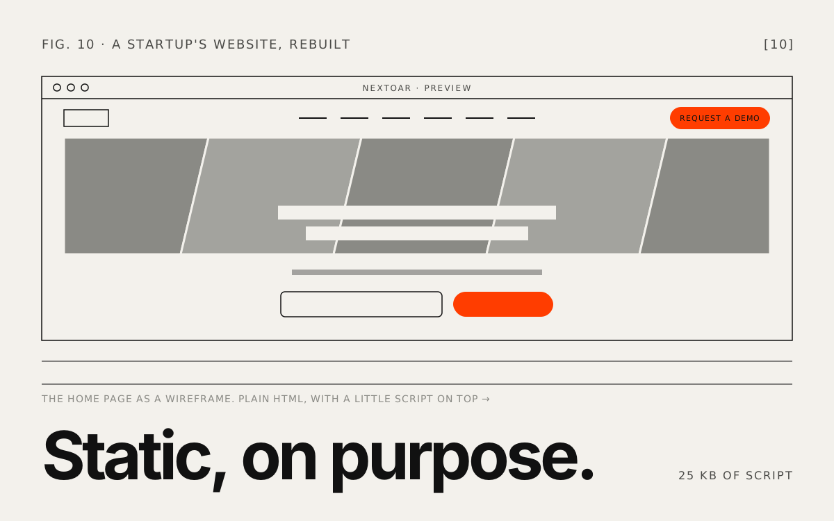
I built the first version in Next.js, because it is what I reach for. It worked, and the longer I looked at it the less sense it made. Every page on this site is the same for every visitor. Nobody logs in, nothing is fetched per request, and nothing changes between one deploy and the next. The only things that move are a rotating headline, an accordion, a carousel, the product wheel, the industry switcher and a form. For that, the browser was downloading React and then re-running the whole page in JavaScript to arrive at the HTML it had already been sent.
So I moved it to Eleventy, a static site generator that does one thing: it takes templates and content and writes HTML files. The components became templates, the content stayed where it was, and Tailwind still produces the one stylesheet. Each piece of behaviour that had been a React component became a small plain JavaScript module that looks for its own marker in the page and does nothing if the marker is not there, so a product page never runs the home page's code.
Moving off a framework also made me careful in ways the framework had let me skip. The pages are written to work before any script arrives. The first phrase of the rotating headline is in the HTML, so the heading reads as a sentence with JavaScript off, and the animation never starts for a visitor who has asked their system for reduced motion. It waits for the font to finish loading before it measures its letters, because measuring against the fallback font left the phrase subtly mis-spaced for the life of the page, and only on a first visit, which is exactly the visit I would never see on my own machine. The fonts are served from the site itself. The product video is a thumbnail until someone presses play, so YouTube's player is never loaded for the many visitors who do not.
What Eleventy gave back was simplicity I can hand over. The output is a folder of files that any host can serve, there is nothing on a server to update, and an article is a text file that goes live on the next deploy.
Where it stands
The site is finished and running on a preview address, which is the link on this page, while nextoar.com still serves the old one. The new pages already name nextoar.com as their address and the sitemap lists all 18 of them there, so the switch itself is a change of where the domain points. The one job left on my side before that is the photography: the code is small, and most of what a visitor downloads now is images, which I still have to resize and compress.
Want to talk? Say hello.
A project, a question, or just to compare notes. I read everything and write back within a couple of days.